Mid-life makeover
In 2023, the children and youth film festival in Malmö, Sweden turned 40. To highlight and celebrate the anniversary, I was tasked with developing and implementing a new visual identity.
The main challenge with designing for an audience consisting of children and youth is that tastes and interests change very quickly when we are young. Something that will appeal to six year old will not necessarily grab the attention of a teen. Based on these challenges, we developed a few key goals with the redesign, some of which seem obvious but had been lacking previous years.
- The centerpieces of the design must very clearly communicate that this is a film festival
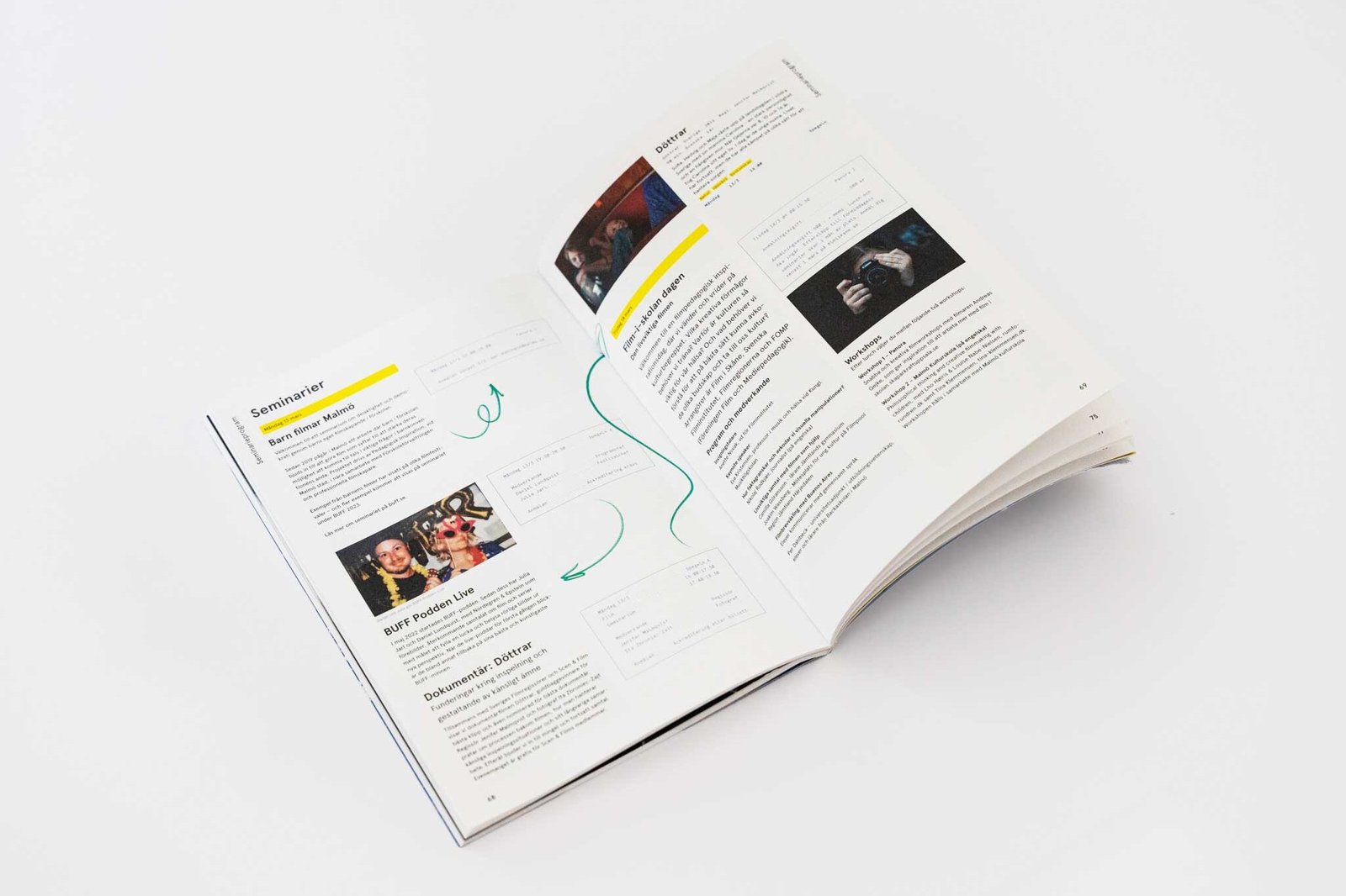
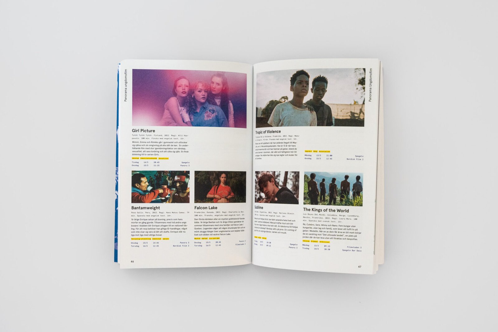
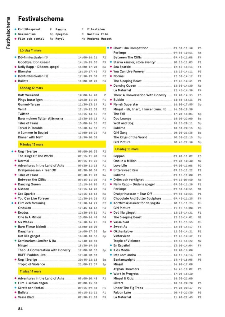
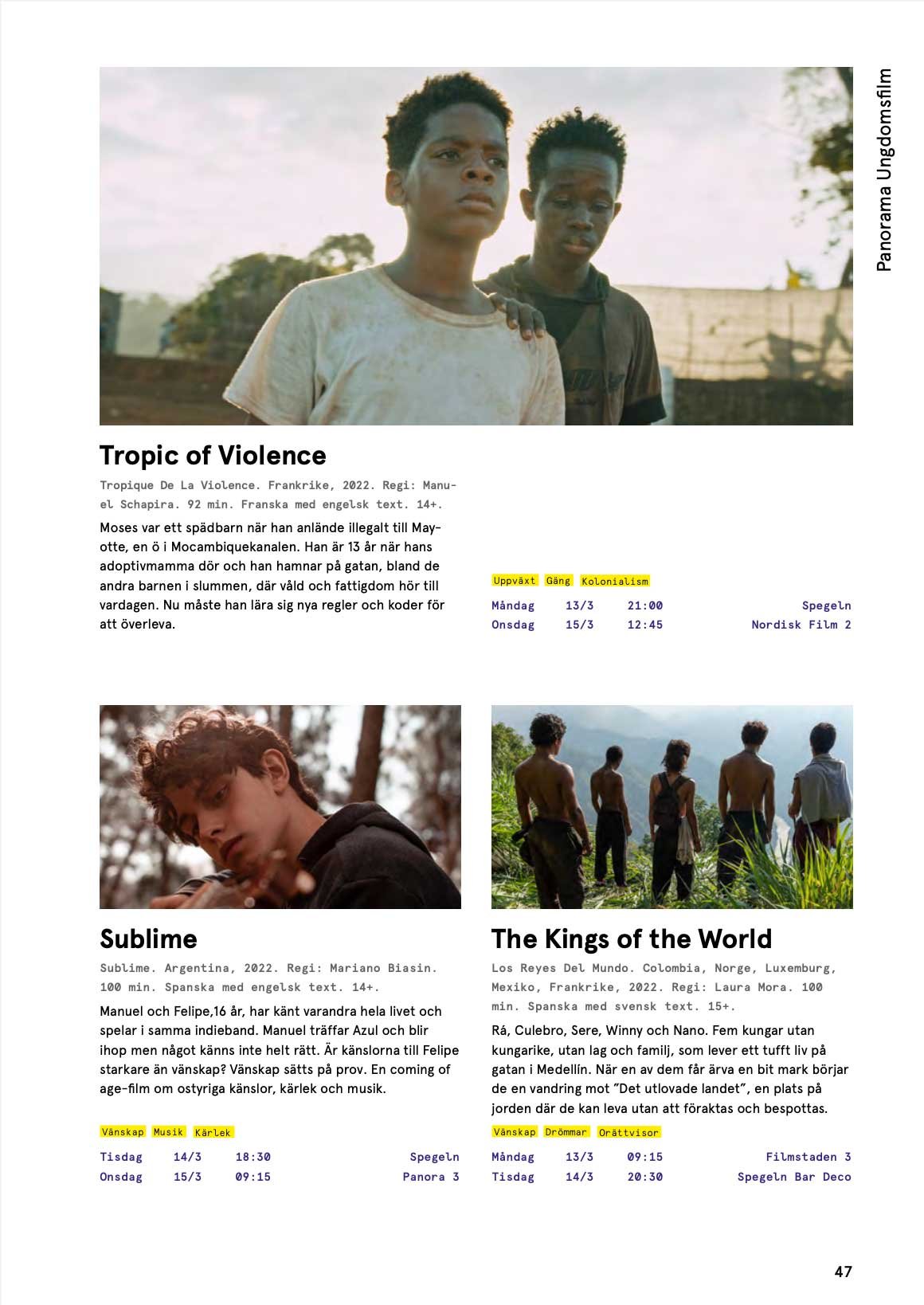
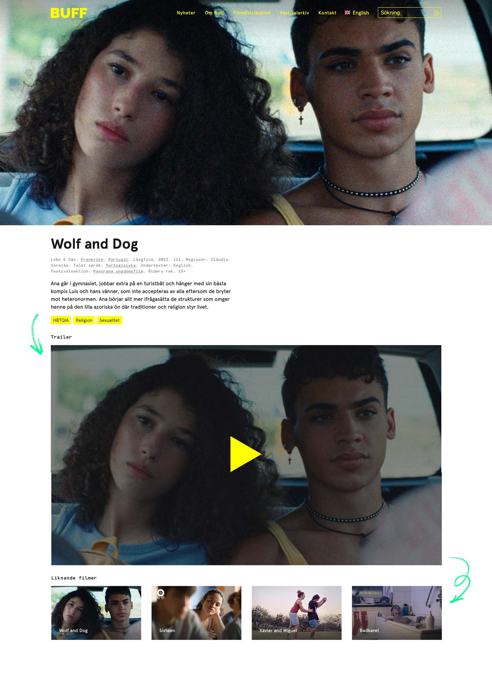
- Both the print and online festival program must be easy to understand and sort through
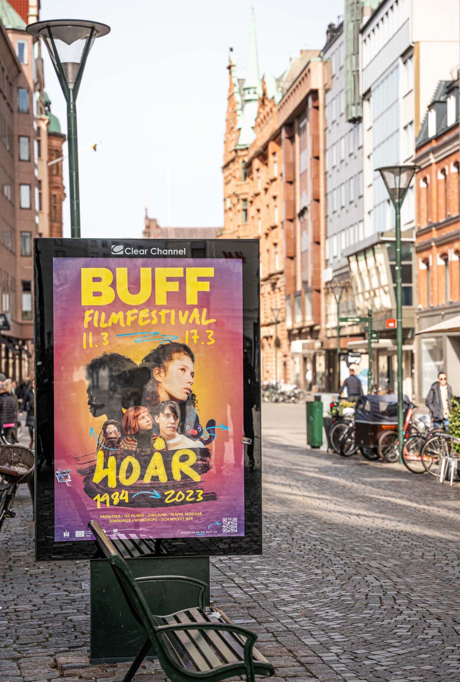
- The design must be flexible enough to be implemented across many different types of media, and by many different people
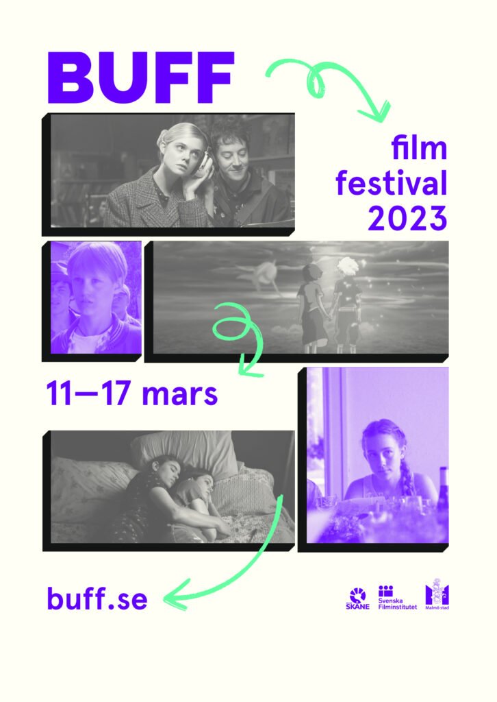
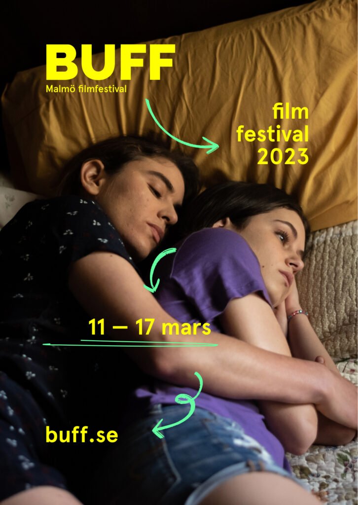
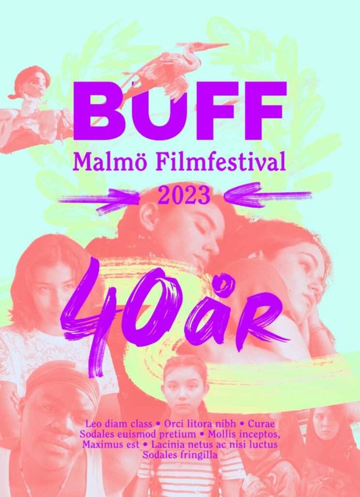
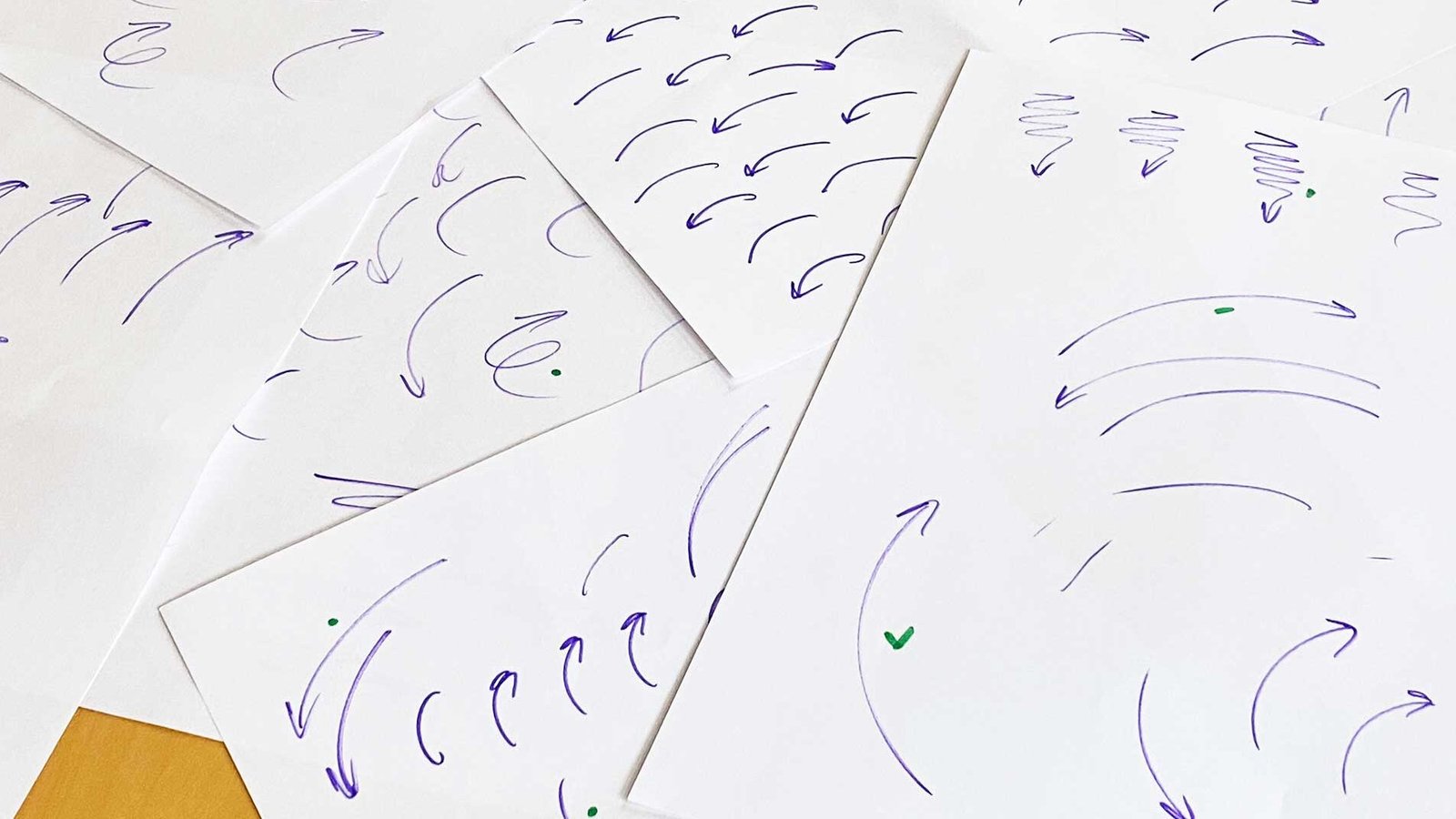
Based on these criteria I started putting down ideas for the new identity. Because posters would be the main mode of communication for the festival, so it made sense to try and capture the ideas in this format first. Doodles and hand drawn text was used to reference kids drawings and sketches in school notebooks. They also proved to be a flexible design element.
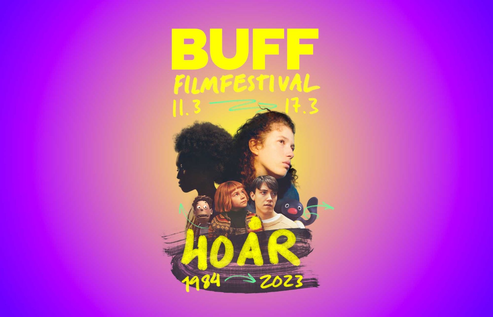
The main-character-face-collage
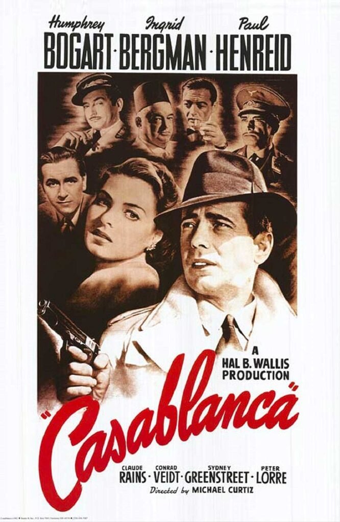
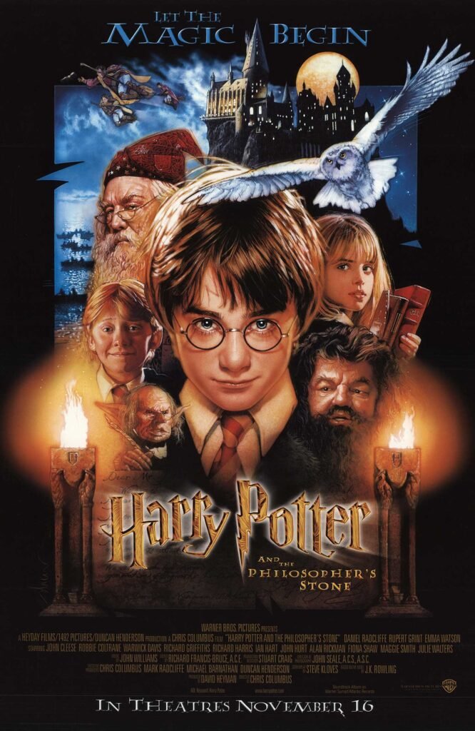
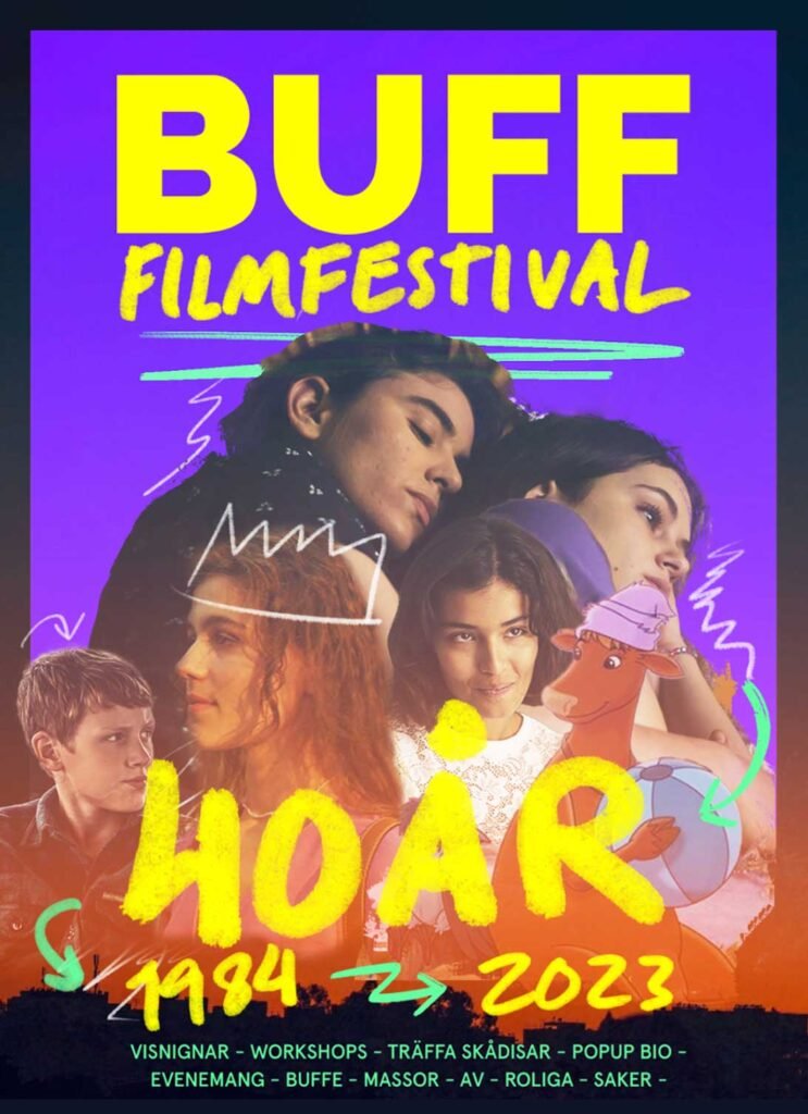
While many of these sketches felt strong in their own right, they did not quite accomplish one of the most important goals we set out for ourselves – they did not scream film festival, more than the words themselves. I searched for references, and while film festivals all look very different, film posters however do have some distinctive elements that could prove useful. Among these elements, the main-character-face-collage is one that seemed to most clearly communicate that this is about film and nothing else.
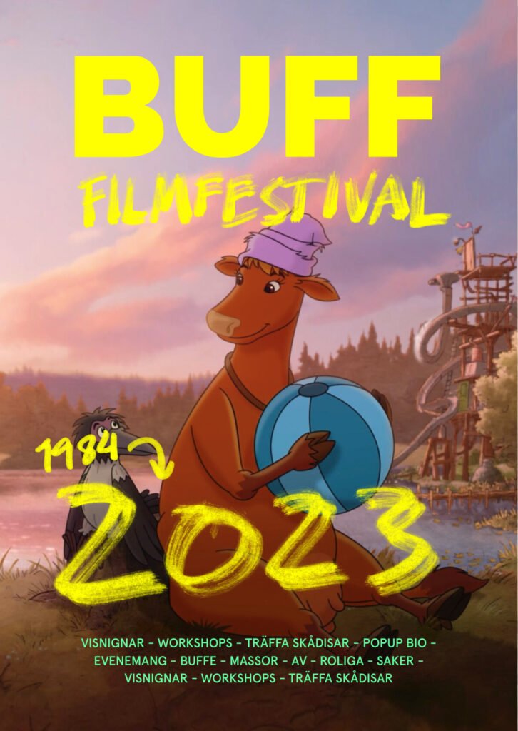
Since the 2023 festival program was not yet decided, I started experimenting with collages using past years films and images. I also tried incorporating an award laurel in the design, as this is a common element used by film festivals.
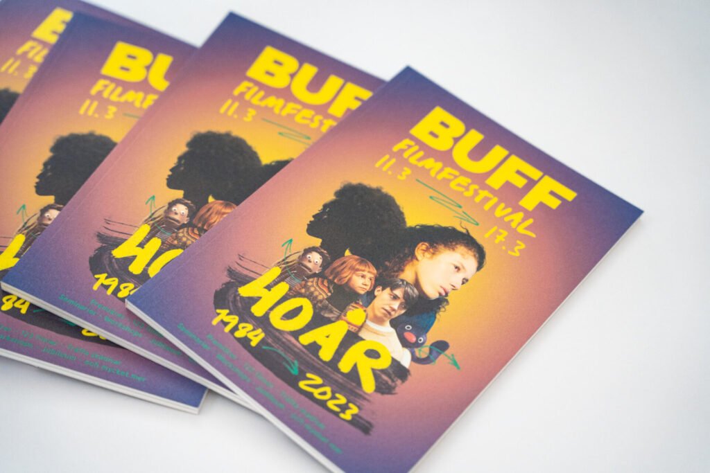
As the film program was finalized I grabbed new images and movie stills to complete the final poster. During this process I also created all of the hand drawn assets used in the visual identity, that had previously been sourced from different places online for prototyping.
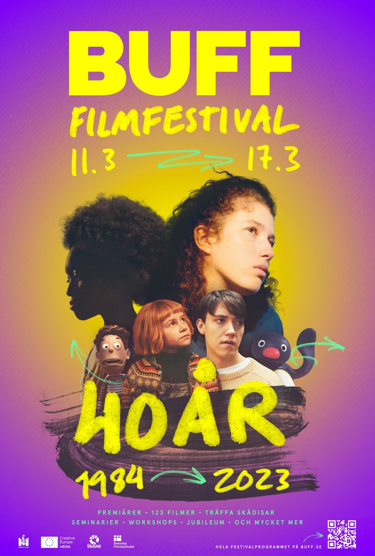
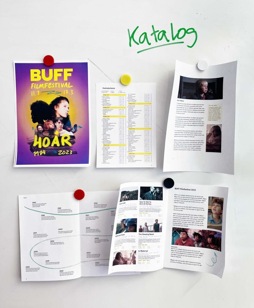
After the centerpiece of the design was completed, the catalog and other deliverables started falling into place.

Video
As the festival was coming closer, we also needed video promotion, both for social media, but also for the opening ceremony and award gala. Since this was the 40th anniversary, I wanted to create something that effectively showed the festivals legacy, while at the same time showcasing this years films. The video also gave me the chance to bring the doodle elements from the visual identity to life through animation, as well as work on a fitting soundtrack.
Learnings
My main takeaway from this project is something that I think has to be learnt time and time again – that a visual identity and the designs that come out of it are only successful if they manage to achieve the goals they are meant to fulfill. As you can tell from the exploration phase above, I started out with drafts that felt nice and looked nice to me, but did not fulfill their purpose. Instead I ended up with something that I would not necessarily be attracted to, but which did do a much better job of completing our goals of strong identity, clear communication and flexibility.
—
More early drafts and design ideas can be found here.